| Perpetuum UI Controls for Windows 8 2.0 |
|
A set of unique 10 XAML UI Controls for Windows 8 applications
| Publisher: |
Perpetuum Software |
 |
| Downloads: |
1 |
| Software Type: |
Freeware, 0.00 |
| File Size: |
609K |
| OS: |
Other |
| Update Date: |
18 May, 2013 |
Perpetuum UI Controls for Windows 8 a set of XAML UI components that will help you create Windows Store apps. The package includes 10 WinRT controls that conveniently extend standard WinRT features. They are: radial menu, plain menu, date and time picker, calendar, rating and flyout controls, color picker, text box and numeric box, expander.
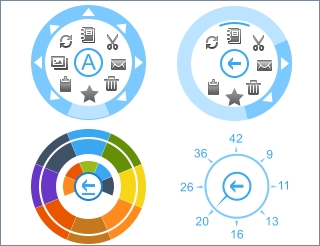
Radial Menu Control.
Make complicated hierarchical menus be simple and compact! Radial menu is a quite logical and easy-to-use application component that novices and experts will really love.
Calendar.
The calendar control is used to select and navigate through dates.
Color Picker.
Add ability to change color of your Windows 8 application elements with Perpetuum Color Picker. You can select required color from a palette or select a more suitable tone in the color editor.
Text Box.
This component extends standard Windows 8 text box control with the ability to add any specific items including buttons inside the text box. The control can validate entered characters and allow only letters or only digits or both.
Plain Menu.
Common flat menu control composed in a more convenient way. All nested menus are not thrown apart of main menu, they appear instead of it thus leaving more free space for the application content.
Time Picker.
The component sets time with the help of two elements for setting hours and minutes.
Date Picker.
The component sets date using the drop-down calendar control.
XAML Rating Control.
Add the ability to rate some content to your Windows 8 apps, this is the easiest way to get feedback from your customers.
Numeric Box Control.
Numeric box adds the ability to change some numeric values to your application.
Flyout Control.
Flyout control will allow you to easily add compelling flyout menus of the target application element.
Expander.
Expander control provides a way to provide content to the users in an expandable area that resembles a window and includes a header.
|


